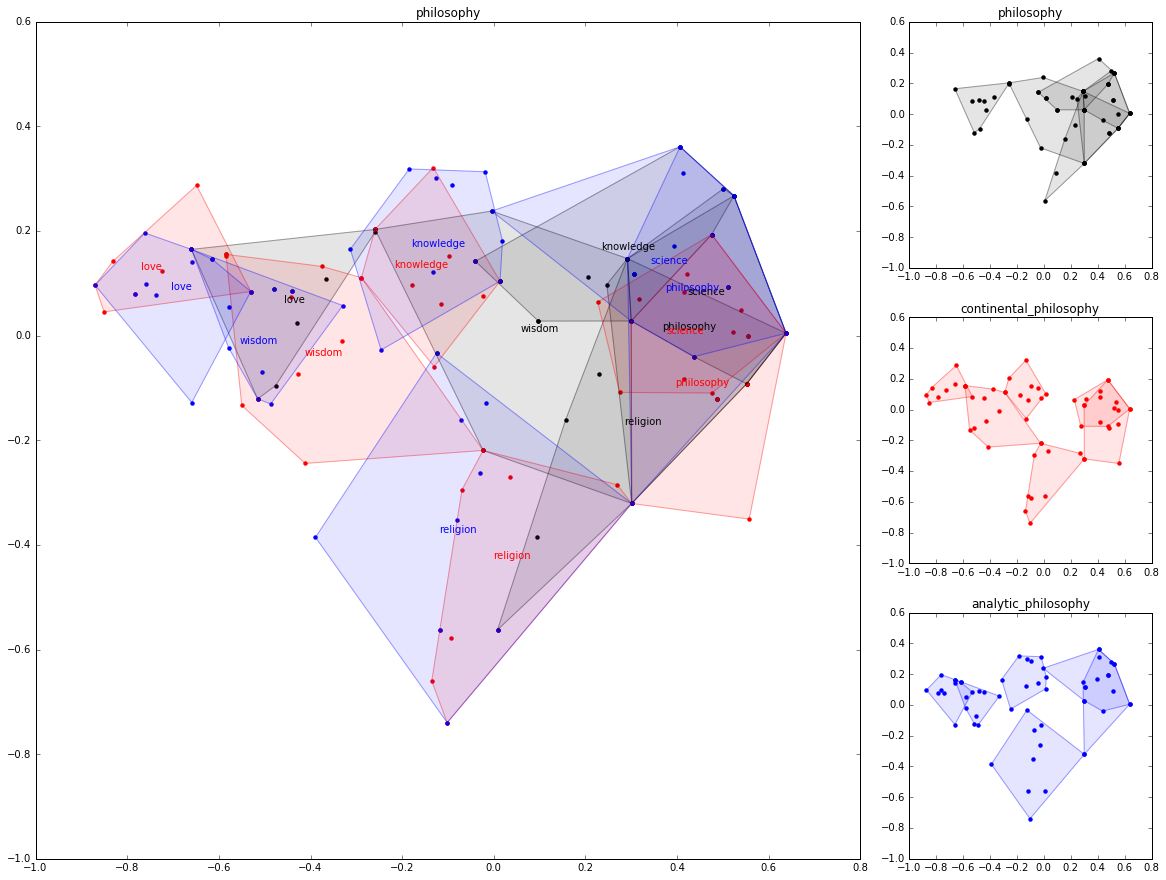
This is a side project we are investigating with some friends in order to see if contemporary machine learning methods such as word2vec can be used to produce social mapping with layers of complexity.
Distributed computing over core grids is also a playground to look at viability of reading maps based on networks. After a simple statement formalization it is easy to see if hypothesis are strong over ten of thousands of different maps produced with the same corpus and samples of that corpus.
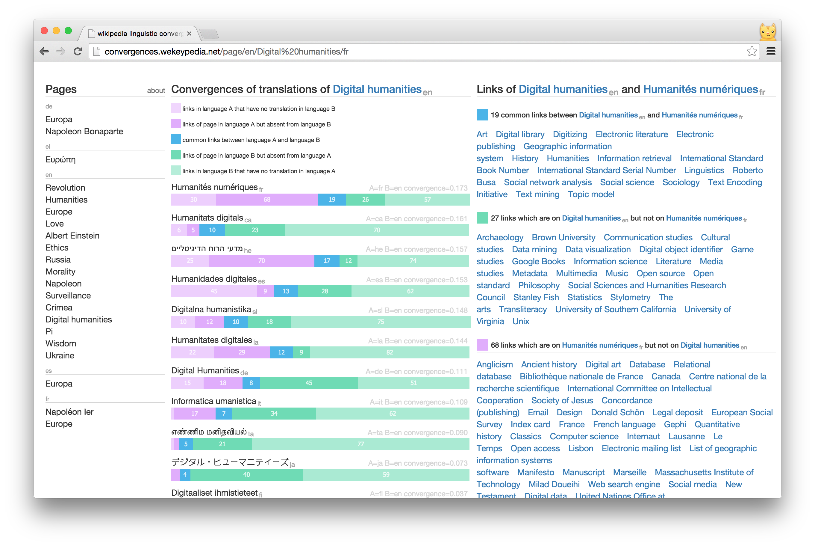
Convergences is a web visualization of convergences and divergences between the different languages of wikipedia as a proxy of distances between cultures.
The python code to reproduce the experiment can be found in this github repository. It relies heavily on the wekeypedia python library and is a good example of how collective intelligence can be hidden in the network of links and metadata.
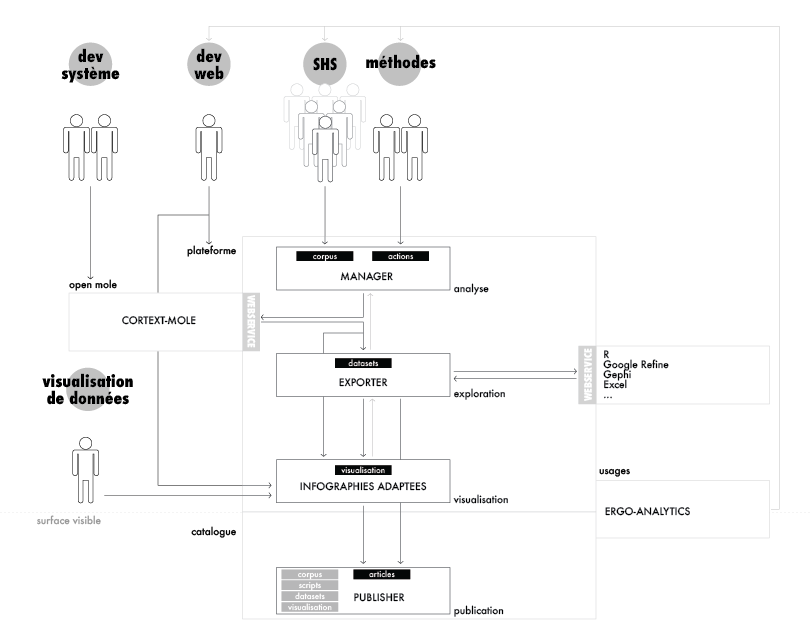
The goal of the cortext manager platform is to deliver a ready-to-go tool for humanities and social sciences researchers to perform text analysis over big corpora. Beside integrated text mining algorithms, the main up value was the integration of network visualization and mapping.
In this context, my task was to drive the design and development of the plaform through service design analysis and information architecture.
We are proud to have very modestly contributed to the crowd-sourced production of Nils Aguilar's film : voices of transition.
If you are interested in permaculture, transition or food sovereignty, this documentary is must-check and must-support !
Contacted by the UN Global Pulse initiative, we were part of research dream team composed of scientits affiliated to ISC-PIF and IFRIS.
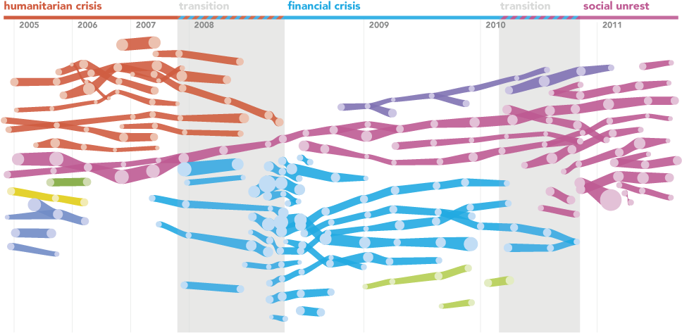
We have then been asked to build a prototype using real-time data to monitor world-wide issue of our choice. By common concerns, we chose to work on the problem of media framing of the food security public issue.
The result is a stand alone website : pulseweb
We are still about writing scientific articles about the algorithm and the analys. Stay tuned (:
The website source code is available on github : taniki/pulseweb. It relies mainly on python for the server part and javascript (paperjs) for the front-end.
We also used scriptographer to produce infographics for the white paper.
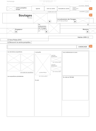
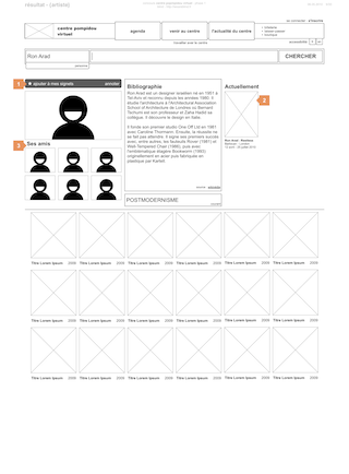
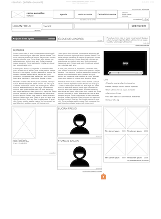
In 2010, Centre Pompidou Museum (National Museum of Modern and Contemporary Art) consulted several french design agencies for the redesign of the museul website.
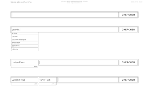
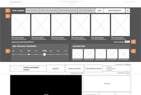
Blind was part of those agencies. A lot of attention have been put on the articulation between information architecture and information design.
We lost the constest (still being 6th of 30) but it was a great experience. Let's say that Selina Ebert, art director, provided the great modernist spirit that fueled the whole project.
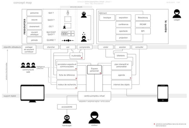
For this project, we made an heavy use of concepts maps as blueprints for the organization between content and interaction. As functionnalists, we primed minimalism between the use and the form.
Maps were great tools to communicate and get quick consensus on fundamental understandings of the team.
Information architecture was important as a set of skills in order to share complex concepts, various point of views and transforming the collective works as a sustainable space of ideas and concepts.
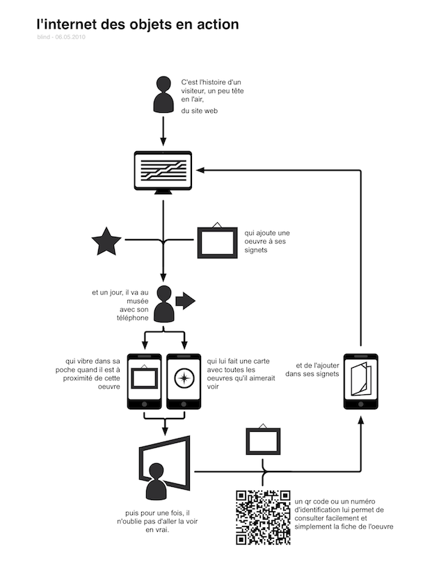
Even if it was requested by the brief, we tried to push the innovative concept of web of objects to a certain reality. We then provided a full transversal framework of independant information designed dispositifs. The website is used as intended but is also augmented by the eco-system in which it is taking part.
The idea is not new. We just take it as something to realize. Most of the concept and analysis work can be found in books such Bruce Sterling's Shaping Things.
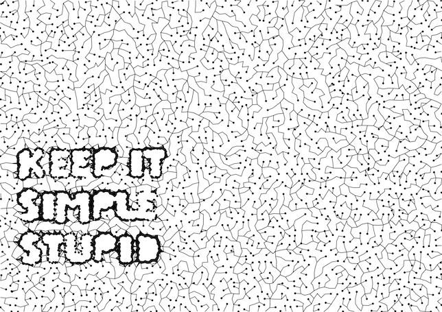
Small project for a small poster dedicated to the anniversary of blind. We all designed and printed a poster for the occasion and made a cool party in a parisian bar. It was fun.
The poster used a generative algorithm based upon a branching system derived from a small attraction/repulsion of "random" walkers. The letters or shapes can be grow by adding a set of repulsors.
It has been implemented with nodebox framework/IDE. The code is not formidable and could be a day or another on github. You can still ask by email.
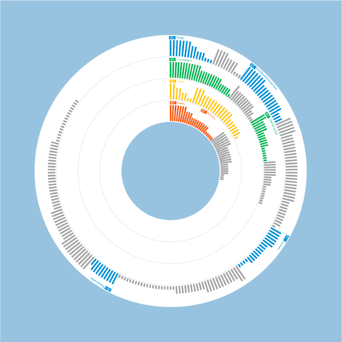
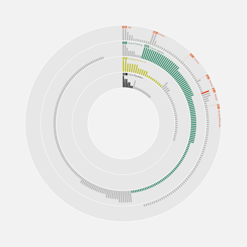
IRIS was a data visualization project commissioned by heaven. The main purpose of the project was to show to clients the effectivness of the community management teams.
It was then important to have a scalable visualization that permit comparison between periods.
IRIS can also be used as representation of differential amount of work between clients and missions.
To clarify the visual representation, the system uses 3 differents dimensions.
The posters have been produced with a python script using the nodebox framework/IDE.
The community mangers provided CSV files from their reports and we returned them the visualization in various vector formats (PDF, EPS and SVG) in order to be included in their own workflow (MS Powerpoint mainly).
The software also used to let the possibility to parametrize the colors in order to producre posters more compatible with the client's branding.
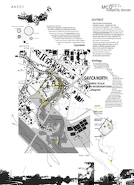
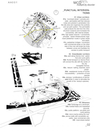
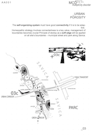
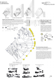
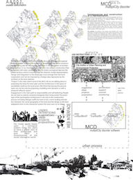
MultipliCity Disorder was a collaboration with Angelique Chemois (architect) and Ola Wasilkowska (architect) and a proposal to the Europan 9 contest. We tried to invest into network theory and ecosystem modelling in order to open up a new way to think the territory and the relationship between the architects, urban planning and the communities.
The main idea was to use a prey-predatory model to constraint diversity within a landscape. We also played with the concept of strangification to develop the idea that architectural intervention needed a translation effort.